
Brad T.
May 6, 2023
Every wonder what the US population by state looks like from afar?
The link near the bottom of this short article displays an interactive web-mapping application which includes state, county, and census tract-level data from the 2020 Census. In addition to US population by state and county, the persons-per-square-mile heat map also includes other key US demographics, as shown in the below photo:
US Population by state mapping feature
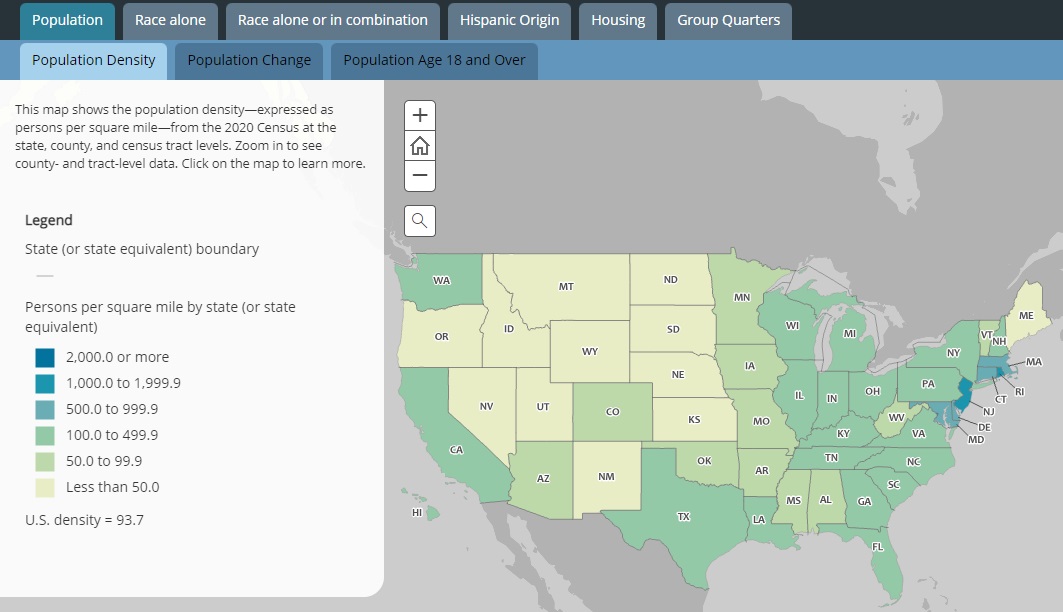
US population by state heat map
As you can see, the darker the area, the more densely-populated the state is from a square-mile perspective. Zoom-in, and you will find the map automatically adjusts to show the same population data – from a county outlook.
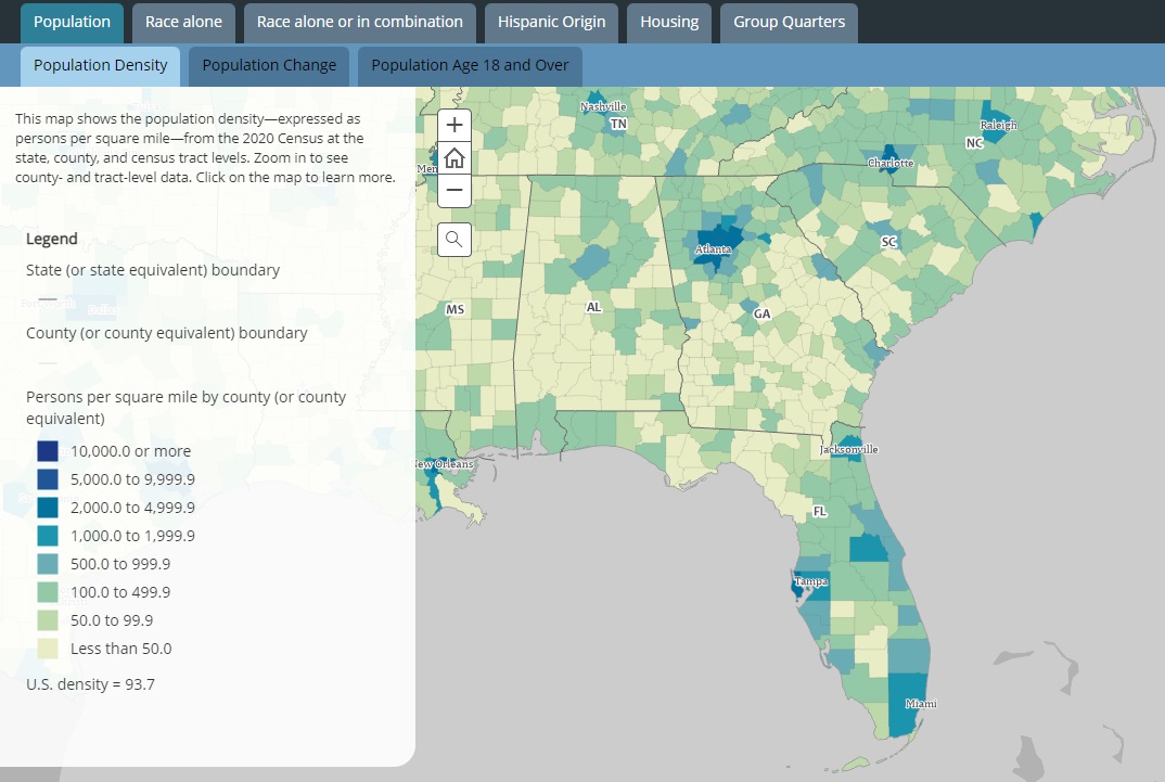
Heat map zoomed-in, by county
– Keep in mind this is a data is from 2020, but with few exceptions – remains highly accurate –
A Few Takeaways:
With few exceptions, most all areas of the United States are projected to experience population growth over the next 10 – 20 years and beyond. This means the blue and aqua colors on the maps above (no matter what their geographical location) will continue an outwardly spread. If there are any doubts to the expected increase in US population by state, please refer to this map, which shows each state’s projection population growth up to 2040.
One may also refer to The Congressional Budget Office which predicts total US population will increase from 335 million in 22 to 369 million in 2052.
For those who may be looking to carve a new path and potentially distance yourselves from states that are becoming increasingly populated, join the club. Hundreds of thousands of Americans (and many large corporations) have fled inner cities in the last few years. More people are beginning to see with their own eyes that the higher-density of population, the worse things are.
If you’re one of these people, the population density map below may be helpful in your search for safer and more ideal family-oriented horizons.
Density Heat Map
Conclusion:

The unfortunate reality is that from an economic standpoint, hard times for many people are on the horizon. As a result of that – violence, homelessness and overall societal dysfunction in the densely-populated areas will become considerably worse. Over the last three years, we’ve seen what large masses of people are capable of when they’ve been absolutely brainwashed by the nefarious media with destructive propaganda. Imagine what these same masses of people will be willing to do when they’re no longer afford to put food on the table?
Our feel is that over time, living in rural areas or areas that are less-populated will become more and more popular. Simply put: living in rural areas offers your family a greater level of opportunity, general safety, and overall welfare.
Note: While this heat map may be informative, we feel that our compilation of future growth projections HERE may be a much better tool for those looking to project into the future.
We feel this US population by state mapping feature may be helpful to those seeking greener pastures. Regardless, we hope you find this short article helpful in your God-given right to pursue a better life, more liberty and greater happiness.”
Recent Blogs
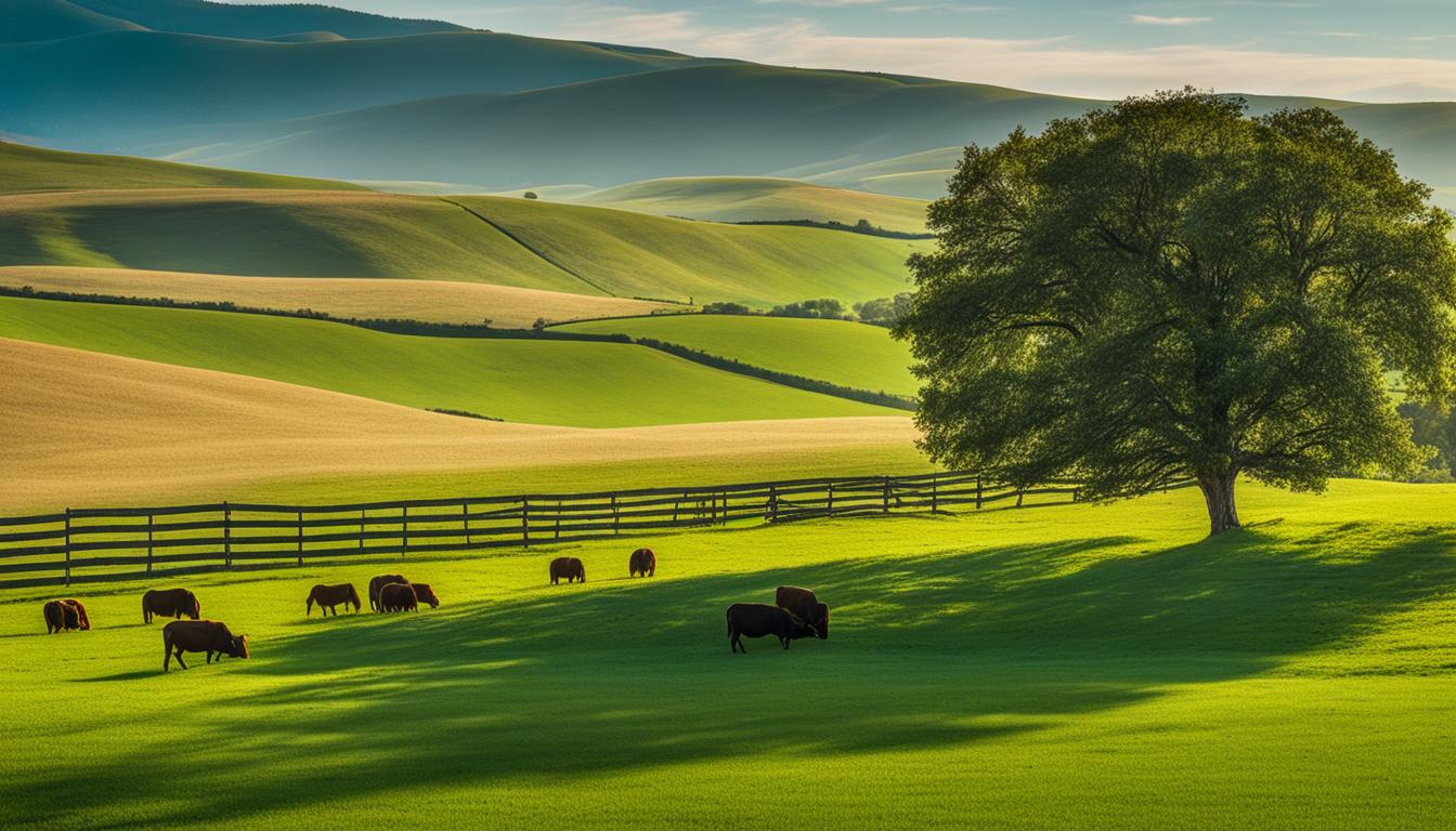
The Joys of Living In Rural Areas: Serene Bliss
Living in rural areas offers a unique and enchanting experience that is unparalleled. The serene bliss of countryside living provides a break from the hustle and bustle
Land Investment: Value Increase Over Time Explained
Welcome to our guide on investing in land and understanding the potential value increase over time. Land can be a lucrative investment opportunity, offering enticing returns and
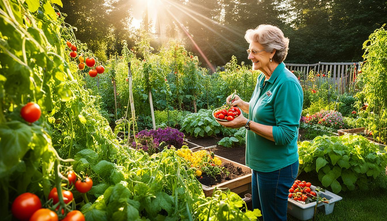
Benefits of Home Gardening: Why It’s Vital
Welcome to our article on the benefits of home gardening. In today's fast-paced world, where convenience often takes precedence, the act of nurturing and growing plants in
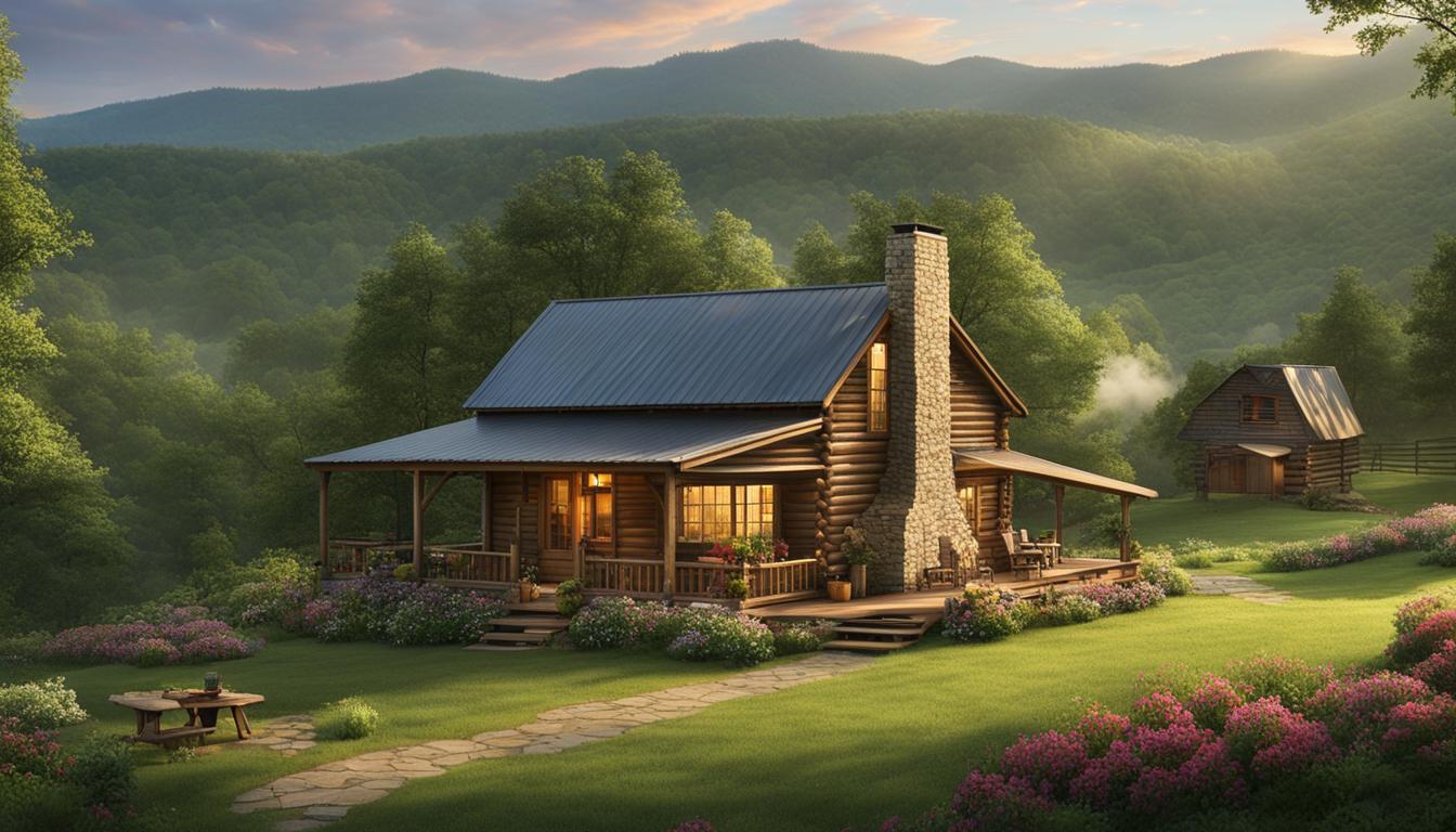
Living in the Appalachians: Insights & Lifestyle
Welcome to the breathtaking region of the Appalachians, where the beauty of the mountains and the warmth of its communities create a unique and enriching living experience.
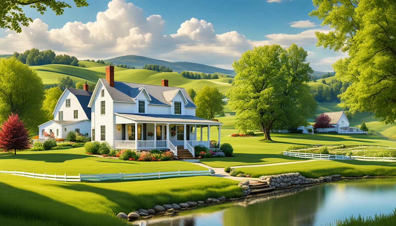
Why More Americans Choose Rural Life in 2024
Over the past decade, there has been a noticeable trend of Americans moving away from crowded cities and embracing the quiet, serene lifestyle of rural areas. In
Investing in Rural Land: Essential Tips
Are you considering investing in rural land? Whether you're looking for a peaceful getaway or an opportunity to diversify your investment portfolio, rural land can offer unique
Comparing Affordability: Rural Living vs. City Living
When it comes to choosing a place to live, affordability is often a top consideration. Rural areas can offer a less expensive lifestyle compared to bustling cities,
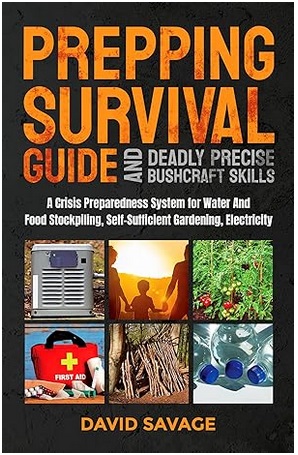
The Importance of Prepping and Survival Skills – Interviewing David
The Importance of Prepping and Survival Skills: Interviewing David Savage Ever wonder what you'd do in a crisis situation in which
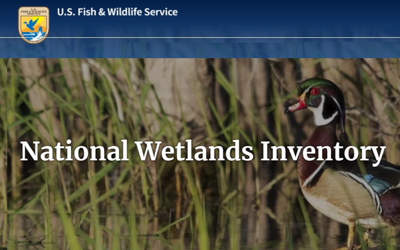
How to Know if a Property is in a Flood Zone
How to Know if a Property Is in a Flood Zone Here, we'll share a really quick way that will allow you to know